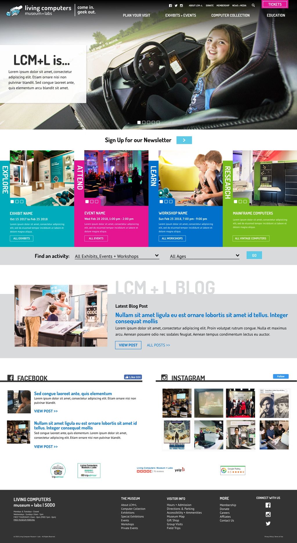
Living Computers Museum
My Responsibilities:
- Gathered stakeholders' requirements
- Researched and conducted competitive analysis
- Created sitemap and wireframes detailing content and functionalities
- Presented my design recommendations to stakeholders
- Designed three very different high-fidelity mockups of home page and the most complicated interior page
- Prepped graphic assets for development
- QA site for visual and functional bugs
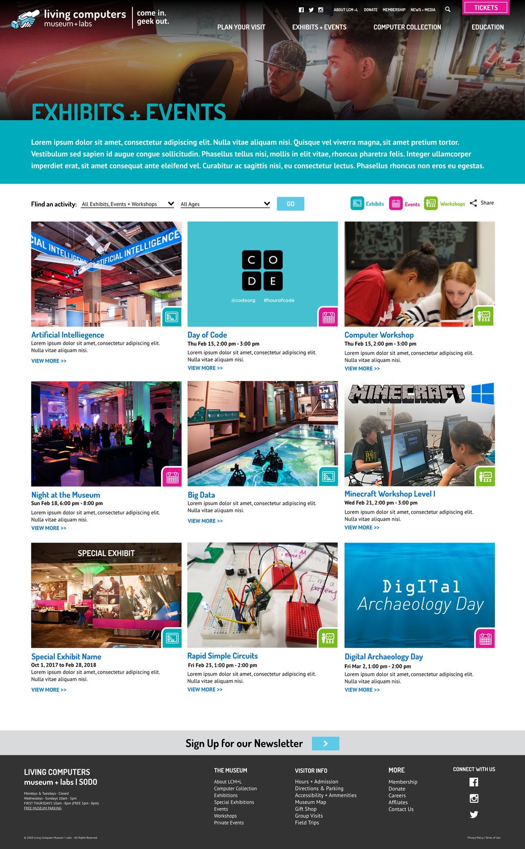
The LCM+L Museum wanted a website that matched their newly renovated museum's branding. The museum had four main color schemes to help guide the visitors of their location. Like the physical space, I used the color coding throughout the site to create cohesive, visual connection between sections and helped users know where they were on the site. I also used the four action verbs "explore", "attend
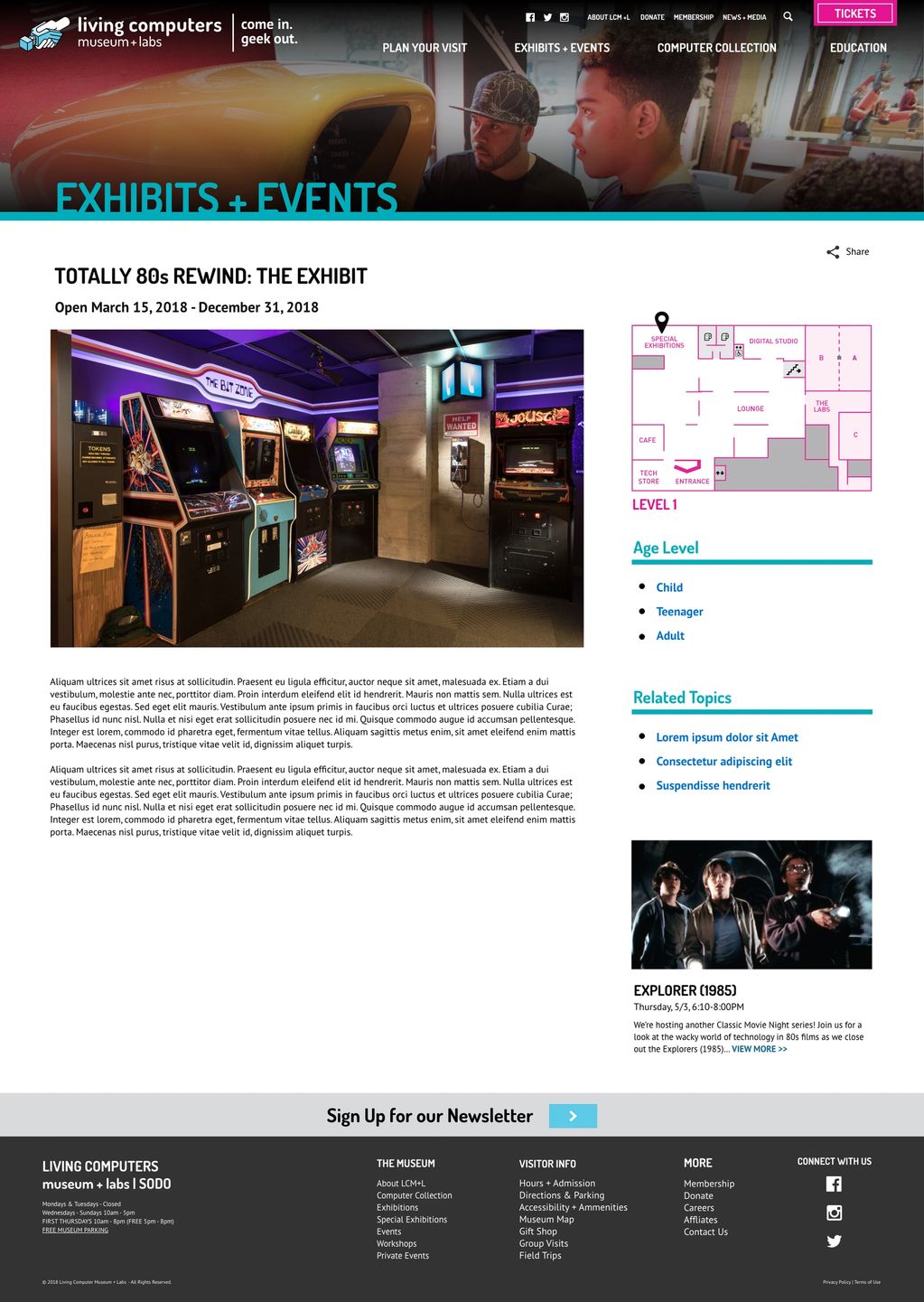
I added a map showing the location, age, and events associated with this exhibit. This was an effective way to cross promote future events or workshops for this exhibit.
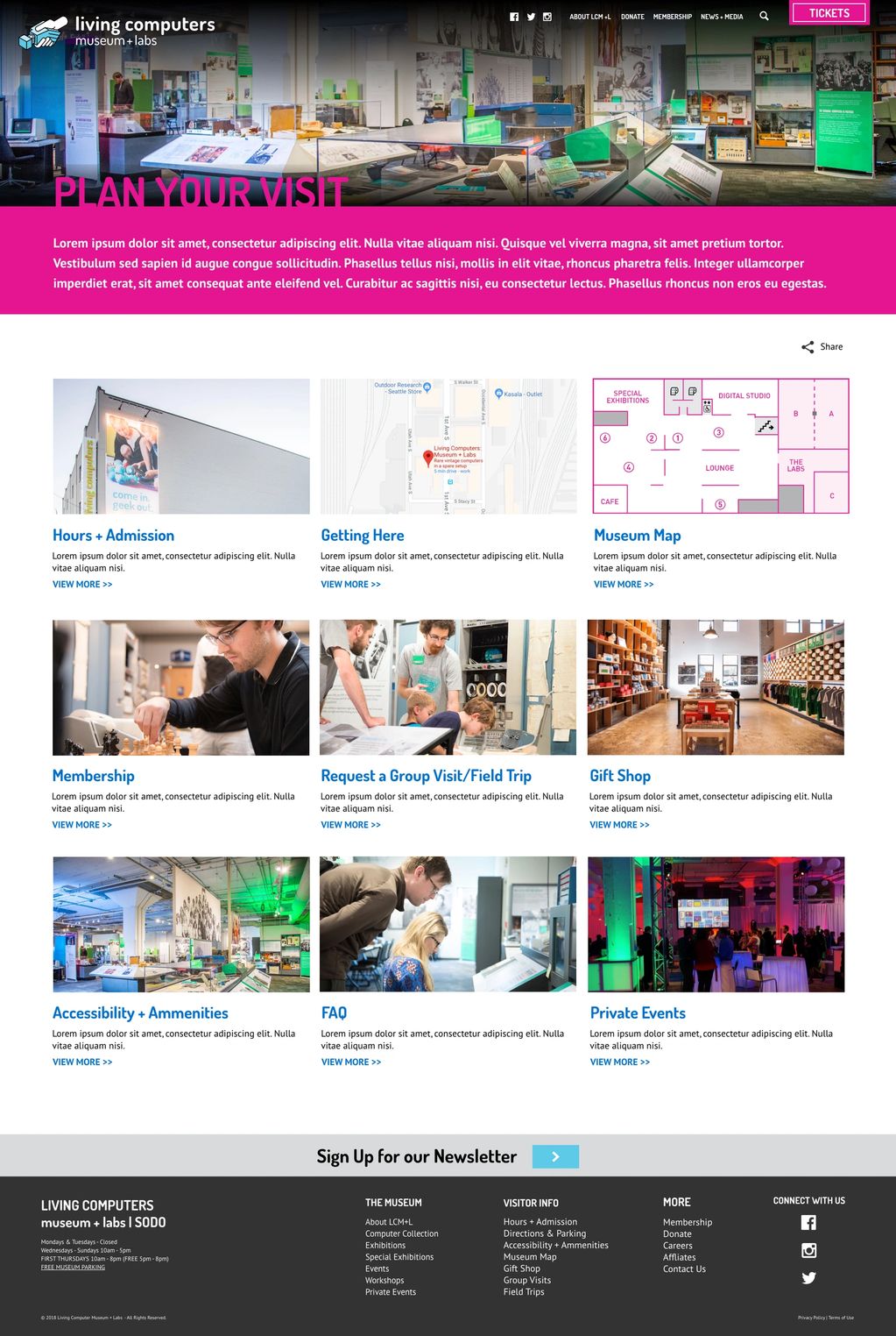
Plan your visit page showed useful information about your museum visit. I included images and a short descriptions to break up the information so the users can easily find what they are looking for.
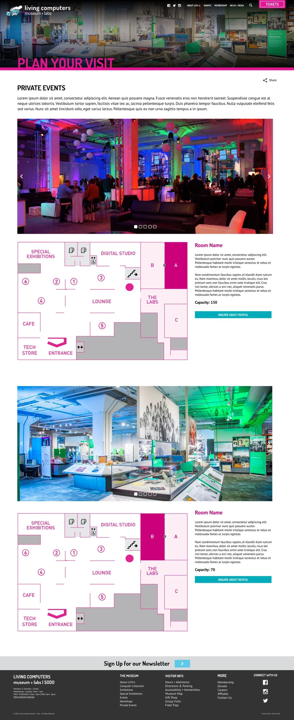
One business goal was to highlight the rental spaces available to host private events. By providing photos, description, map, and capacity, it eliminated the need to contact someone for general venue information.
Copyright © 2023 Mei Chi Chin - All Rights Reserved.
This website uses cookies.
We use cookies to analyze website traffic and optimize your website experience. By accepting our use of cookies, your data will be aggregated with all other user data.
